Statistical tricks of permabears, doomers & cranks. I’m not sure what drives these people, for some it’s promoting dodgy ‘alternative’ investments after the world falls down. Other seem to be living in a doomsday cult of their own creation.
A few of the statistical biases I see a fair amount, I’ll add more when necessary.
False Mean Reversion Bias
Recently I saw a fund manager comparing a bond index to the Nasdaq and implying this was an indication the Nasdaq is historically overvalued.
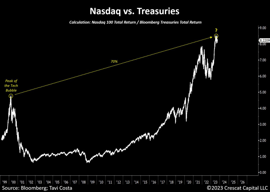
What you learn here is that 100% safe (eventually) investments should underperform investing in growth at the frontiers of the economy. Phrasing this another way, would you expect companies (that in hindsight) that turned out to be world changing to outperform government debt?
Bonds usually provide a percent or 2 returns above inflation, they can be useful in portfolio construction, but stocks outperforming bonds in the long run is a feature not a bug.
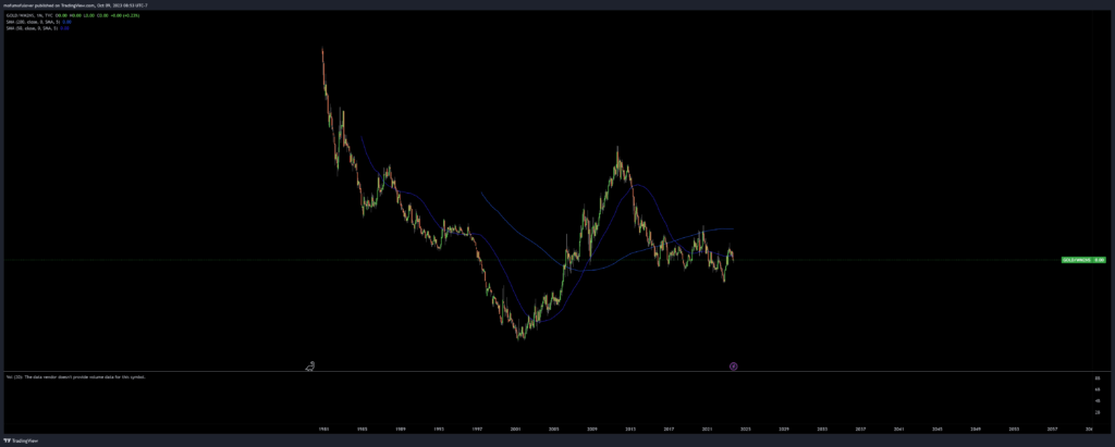
Another common example of false mean reversion is comparing stock indices to gold. Due to the gold bubble of the 1980s, you can roughly create the illusion (excluding dividends) that stocks and gold return roughly the same thing over time.
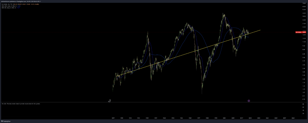
(Log Chart of Dow to Gold)
We can see that the dow clearly outperforms gold, even without dividends, but during the 1970s-80s, during the end of the gold standard their was a brief pause of this relationship. Most likely gold went into a speculative bubble of it’s own, rather than the dow spending most of it’s time in a bubble.
False Denominator
Maybe you’re not the type to be convinced that the stock market’s returns are clearly unsustainable so what if instead we convinced you that the stock market has actually been delivering terrible returns.
Usually this trick is achieved with a misleading heading claiming to be an inflation adjusted index. Permabears tend to cluster with people who believe the CPI is massively underreported, a belief that to some extent has faded since the CPI got massively ahead of 2.0%.
They’ll claim some variation of ‘real inflation is the money supply’ or that adjustments were made to the CPI formula in the 1980s, and that’s how they stopped the great inflation, rather than inflation actually falling.
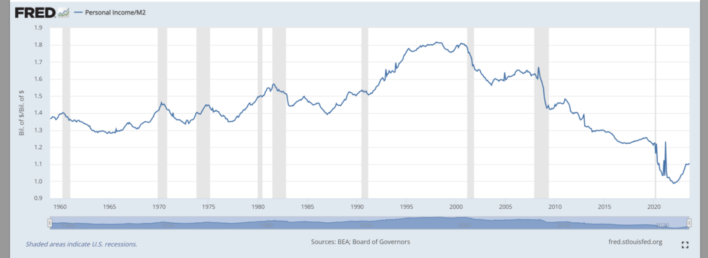
The following is a chart of the S&P 500 index divided by the M2 “money supply” statistic. The problem with this series mainly occurs after 2008, the M2 has become a poor measure of quantity of money since QE added so much ‘dead’ money to the economy. You could try to fix it by subtracting the federal reserve balance sheet, but I’m not sold on it’s usefulness.
Quantity of money has a lose relationship with inflation, if the money supply were doubled to pay off government spending, it would obviously cause high (if not hyper) inflation, but unorthodox monetary policy such as QE does not seem to have the same effect.
Whenever you see a weird inflation index, try to think it out. CPI says that prices have not quite doubled since 2000, M2 would argue for a 4x increase, if such a statistic were accurate, this is what living standards would look like.
Given that gold (the investment usually promoted by permabears) has underperformed stocks, you might think this wouldn’t help their promotion, but you’d be wrong. They’d instead tell you how cheap gold is by these bogus metrics.
Shadowy Statistics
M2 isn’t the only show in the dodgy statistics town. Another source of dodgy deflators comes from what I alluded to earlier, conspiracies about the CPI modifications made in the 1980s.
ShadowStats, by John Williams claims to offer more accurate statistics that the government doesn’t want you to see. He also offers some estimations of discontinued statistics, such as the M3. The problem with John’s methodology is simple, it’s nonsense.
What I do disagree with is bad statistical methodology. Shadowstats is built on the belief that the Bureau of Labor Statistics changed their methodology in the 1980s and 1990s, and that if we were using their original methodology the level of inflation would be much higher. Shadowstats presents what they claim to be the original methodology. But Shadowstats is not calculating inflation any differently.They are not using the 1980s or 1990s methodology that they believe would be higher. All Shadowstats is doing is taking the CPI data and adding on an arbitrary constant to make it look like inflation is higher!
The Trouble With Shadowstats
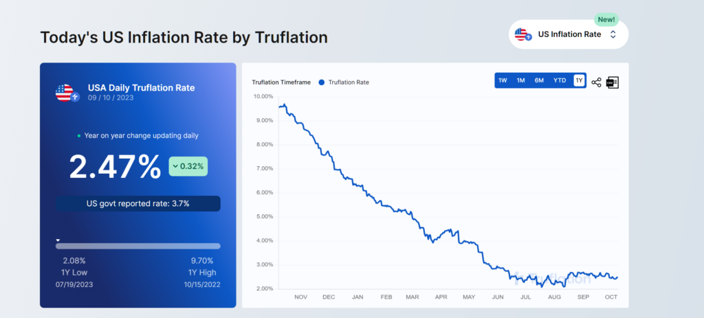
The issue is explained well here, “The trouble with shadowstats”, Shadowstats hasn’t built their own version of the CPI, if you’re looking for that I’d recommend truflation, which also aims to be more real-time. Shadowstats has simply added a constant they claim is roughly equivalent to the governments adjustments.
Last month I called attention to an analysis by BLS researchers John Greenlees and Robert McClelland of some of the claims by John Williams of Shadowstats about the consequences for reported inflation of assorted technical decisions made by the BLS. Williams asked me to update with a link to his response to the BLS study. I am happy to do so, along with offering some further observations of my own.
You can follow the link to Shadowstats’ response to Greenlees and McClelland and judge for yourself, but my impression is that the response is more philosophical than quantitative. In a separate phone conversation, Williams further clarified the Shadowstats methodology. Here’s what John said to me: “I’m not going back and recalculating the CPI. All I’m doing is going back to the government’s estimates of what the effect would be and using that as an ad factor to the reported statistics.”
Econbrowser, dead link.
It also seems there may be a genuine error here. From Williams’ explanation of the methodology. I think he may have mistaken BLS’s estimate of a % reduction to be a PP (percentage) point reduction and ended up with constants where he should have been multiplying.
Outlier Weighted Models
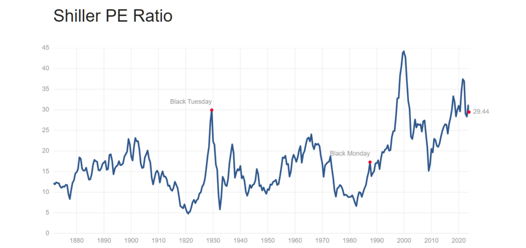
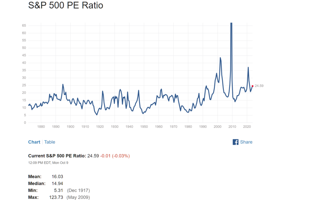
This one was already partially touched on with gold, but it’s a common occurrence for financial black box models. As an example, the CAPE Shiller P/E ratio is sometimes touted as a long term market forecasting model, but in reality, it’s easily skewed by a few datapoints.

Ken explains the issues with CAPE better than I can. In another tweet that I don’t have at the moment, he goes on to explain how the CAPE ratio was inflation from 2009-2019 because of bad bank earnings in 2009. Clearly the valuation of the stock market isn’t based on how banks were doing during the financial crisis of 2008.
Heuristics That Almost Never Work
Term of my own creation, inverse of “Heuristics that almost always work” by scott alexander. Much like how you can almost always be right by betting against unlikely events, you can instead have a chance at appearing brilliant by continuously betting in favor of them (usually in terms of clout chasing, not actual money).
My favorite examples are Dr. Eric Feigl-Ding (PhD not MD) & Peter Schiff. We’ll start with Eric, who has a tendency of labeling any remotely concerning outbreak as a pandemic causer.
A very good way of catching these kind of people is to check back on other relevant events to see what types of claims they were making. Peter Schiff is known for predicting 15 of the last 2 market crashes.
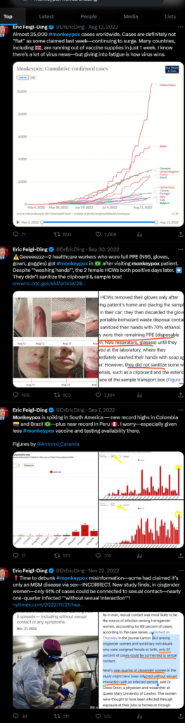

In case you were wondering mpox AKA monkeypox is not airborne. But why does this guy have 1 million followers you might ask. Well, sometimes you can be right, if you have some (limited) knowledge & go with an unlikely prediction. Unlucky for him he was actually forced to remove his COVID thread, but it was, for perhaps the wrong reasons quite prophetic.

Peter Schiff – Financial Prognosticator of doom
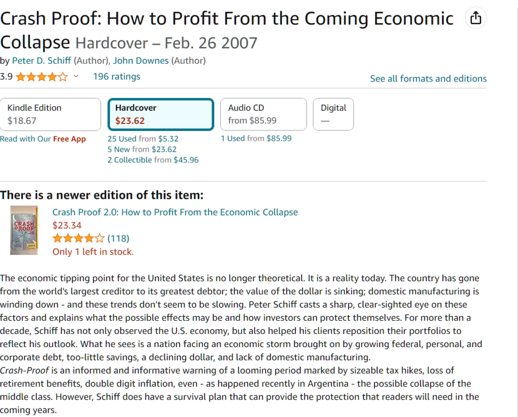
Now we’ll move onto Peter Schiff, who most famously cites the 2008 financial crisis as proof his accuracy. I’ll give him credit where credit is due, he was very much correct on the real estate bubble, but unfortunately his bet was against the United States (vs other countries) rather than against the banks & real estate.
The dollar actually rose following 2008, and Europe & China (which Peter expected to overtake the US) stagnated. The US made a new all time high GDP by 2010, while many European countries spent the next decade stagnating.
As the US recovery got under way, Peter Schiff instead moved to write a new book called “the real crash” implying that the recovery was fake, and we were soon going to see a much worse crisis. A crisis that has yet to arrive & most likely never will.
Conclusion
That’s all for now, I will try to add more when I see them. It’s always a good idea to look for a variety of perspectives on any issue, but I hope these can be helpful as filters for illogical thinking.
If you’re looking for more statistical biases as it relates to financial markets, may I suggest checking out Ken Fishers Debunkery book.
Leave a Reply